Creating Visualizations
Typically, a function that produces a plot in R performs the data crunching and the graphical rendering. For example, geom_histogram() calculates the bin sizes and the count per bin, and then it renders the plot. Plotting functions usually require that 100% of the data be passed to them. This is a problem when working with a database. The best approach is to move the data transformation to the database, and then use a graphing function to render the results.
This article has two goals:
Demonstrate a practical implementation of the “Transform in database, plot in R” concept by showing how to visualize a categorical variable using a Bar plot, a single continuous variable using a Histogram, and two continuous variables using a Raster plot, all using data in a database
Introduce a technique that simplifies the use of complex formulas that are required to move the calculations of the plot to the database
An alternative, is to use a helper R package that already implements the principles shared in this article.
Bar plot
A Bar plot is intended to measure and compare categorical data. Passing the category to geom_bar() as x will automatically calculate the height of the bars based on the row count per category. Here is the code of a typical bar plot using ggplot2:
ggplot(data = flights) +
  geom_bar(aes(x = origin), stat = "count")
Data transformation
Because dplyr is being used to compute the count per category inside the database, the discrete values are separated using group_by(), followed by tally() to obtain the row count per category. Lastly, collect() downloads the results into R:
df <- tbl(con, "flights") %>%
  group_by(origin) %>%
  tally() %>%
  collect()

df
## # A tibble: 3 x 2
## origin n
## <chr> <int>
## 1 LGA 104662
## 2 EWR 120835
## 3 JFK 111279Plotting results in R
The results of the Data Transformation step can now be used in ggplot2 to render the plot. This time, geom_col() is used instead of geom_bar() because the height of the bars have been pre-calculated by dplyr:
ggplot(data = df) +
geom_col(aes(x = origin, y = n)) 
Transform and plot
The plot can be created using a single piped line of code. This is particularly useful when performing exploratory data analysis because it is easy to add or remove filters, or to change the variable that is being analyzed.
tbl(con, "flights") %>%
  group_by(origin) %>%
  tally() %>%
  collect() %>%
  ggplot() +
geom_col(aes(x = origin, y = n)) 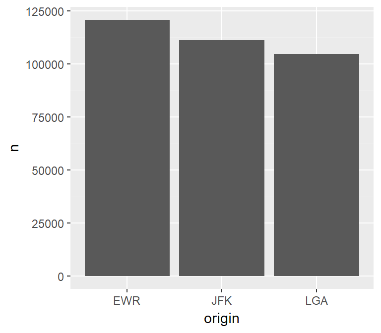
Histogram
The histogram is intended to visualize the distribution of the values of a continuous variable. It does this by grouping the values into bins with the same range of values. In essence, a histogram converts a continuous variable to a discrete variable by splitting and placing the variable’s values into multiple bins.
Calculations
The following breakdown of the calculation needed to create a histogram is intended to highlight the complexity of moving its processing to the database.
For example, if a histogram with 20 bins is needed, and the variable has a minimum value of 1 and a maximum value of 101, then each bin needs to be 5.
- 101 (Max value) - 1 (Min value) = 100
- 100 / 20 (Number of bins) = 5
The first bin will have a range of 1 to 6, the second 7 to 12, etc.
After that, the count of values that are inside each range needs to be determined. In this example, there may be two rows that have a value between 1 and 6 and five rows with values between 7 and 12.
Any formula used to create a Histogram will need to calculate the bins, place the values inside the bins, and only call math functions supported by the database in use.
Using a helper function
An advantage of using dplyr to convert the continuous variable into a discrete variable is that one solution can be applied to multiple database types. This is possible if the resulting formula is made of basic functions that most SQL databases support and is expressed in R, so that dplyr can translate it into the proper SQL syntax.
Unfortunately, the formula is rather long and mistakes can be made if used in multiple locations, because any corrections to the formula may not be propagated to all of the instances. To solve this, a helper function can be used.
In the following helper function, the var input is used to build the formula in an unevaluated R code format. When used inside dplyr, it will return the assembled formula which will then be evaluated as inside the verb command. Feel free to copy this function into your script or R Notebook.
The function has two other arguments:
bins- this allows the number of bins to be customized. It defaults to 30binwidth- this is used to specify the size of the bin. It overrides any value passed to thebinsargument.
library(rlang)
db_bin <- function(var, bins = 30, binwidth = NULL) {
  var <- enexpr(var)

  range <- expr((max(!! var, na.rm = TRUE) - min(!! var, na.rm = TRUE)))

  if (is.null(binwidth)) {
    binwidth <- expr((!! range / !! bins))
  } else {
    bins <- expr(as.integer(!! range / !! binwidth))
  }

  # Made more sense to use floor() to determine the bin value than
  # using the bin number or the max or mean, feel free to customize
  bin_number <- expr(as.integer(floor((!! var - min(!! var, na.rm = TRUE)) / !! binwidth)))

  # Value(s) that match max(x) will be rebased to bin -1, giving us the exact number of bins requested
  expr(((!! binwidth) *
    ifelse(!! bin_number == !! bins, !! bin_number - 1, !! bin_number)) + min(!! var, na.rm = TRUE))
}
Notice that the function returns a quosure containing the unevaluated R code that calculates the bins. To read more about how this kind of approach works, please refer to this article: Programming with dplyr.
It is important to note that the database in use needs to support the functions called in the formula, such as min() and max().
Here is an example of the function’s output. Notice that a fictitious field called any_field is used, and no “missing field” error is generated. That is because the formula has not yet been evaluated.
db_bin(any_field)## (((max(any_field, na.rm = TRUE) - min(any_field, na.rm = TRUE))/30) *
## ifelse(as.integer(floor((any_field - min(any_field, na.rm = TRUE))/((max(any_field,
## na.rm = TRUE) - min(any_field, na.rm = TRUE))/30))) ==
## 30, as.integer(floor((any_field - min(any_field, na.rm = TRUE))/((max(any_field,
## na.rm = TRUE) - min(any_field, na.rm = TRUE))/30))) -
## 1, as.integer(floor((any_field - min(any_field, na.rm = TRUE))/((max(any_field,
## na.rm = TRUE) - min(any_field, na.rm = TRUE))/30))))) +
## min(any_field, na.rm = TRUE)This is an example of the function using binwidth. The resulting formula is a little different.
db_bin(any_field, binwidth = 300)## (300 * ifelse(as.integer(floor((any_field - min(any_field, na.rm = TRUE))/300)) ==
## as.integer((max(any_field, na.rm = TRUE) - min(any_field,
## na.rm = TRUE))/300), as.integer(floor((any_field - min(any_field,
## na.rm = TRUE))/300)) - 1, as.integer(floor((any_field - min(any_field,
## na.rm = TRUE))/300)))) + min(any_field, na.rm = TRUE)Data transformation
The data processing is very simple when using the helper function. The db_bin function is used inside group_by(). There are a couple of must-do’s to keep in mind:
Specify the name of the field that uses the
db_bin()function - If a name is not specified,dplyrwill use the long formula text as the default name of the field, which in most cases breaks the database’s field name length rules.Prefix
!!to thedb_bin()function - This triggers the processing, or evaluation, of the function, which returns the complex formula.
df <- tbl(con, "flights") %>%
  group_by(x = !! db_bin(sched_dep_time, bins = 10)) %>%
  tally() %>%
  collect()

head(df)
## # A tibble: 6 x 2
## x n
## <dbl> <int>
## 1 782. 51999
## 2 557. 48864
## 3 1007. 38889
## 4 106. 1
## 5 331. 1861
## 6 1908. 39942Plotting results in R
Because the bins have been pre-processed on and collected from the database, the results are easily plotted using geom_col(). The resulting bin values are x and the count per bin is y:
ggplot(data = df) +
  geom_col(aes(x = x, y = n))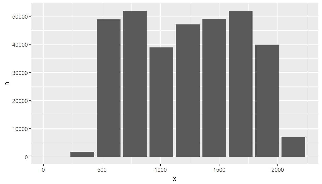
Transform and plot
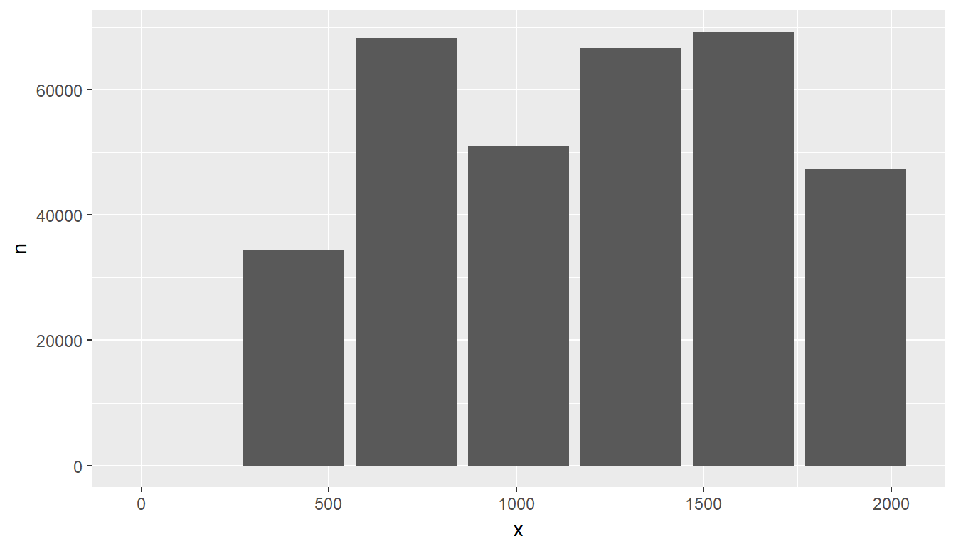
Just like with the Bar plot, the entire process can be piped. Here is an example of using the binwidth argument instead of bins; additionally, the bin size is widened to 300-minute intervals:
tbl(con, "flights") %>%
  group_by(x = !! db_bin(sched_dep_time, binwidth = 300)) %>%
  tally() %>%
  collect() %>%
  ggplot() +
    geom_col(aes(x = x, y = n))
Raster Plot
To visualize two continuous variables, we typically resort to a Scatter plot. However, this may not be practical when visualizing millions or billions of dots representing the intersections of the two variables. A Raster plot may be a better option, because it concentrates the intersections into squares that are easier to parse visually.
A Raster plot basically does the same as a Histogram. It takes two continuous variables and creates discrete 2-dimensional bins represented as squares in the plot. It then determines either the number of rows inside each square or processes some aggregation, like an average.
Data transformation
The same helper function used to create the Histogram can be used to create the squares. The db_bin() function is used for each continuous variable inside group_by(), but in this case the number if bins is increased to 50:
df <- tbl(con, "flights") %>%
  group_by(
    sc_dep_time = !! db_bin(sched_dep_time, bins = 50),
    sc_arr_time = !! db_bin(sched_arr_time, bins = 50)
  ) %>%
  summarise(avg_distance = mean(distance)) %>%
  collect()

head(df)
## # A tibble: 6 x 3
## # Groups: sc_dep_time [6]
## sc_dep_time sc_arr_time avg_distance
## <dbl> <dbl> <dbl>
## 1 1953. 2170. 596.
## 2 2044. 2123. 201.
## 3 1728. 1887. 496.
## 4 1863. 2076. 687.
## 5 1638. 1793. 422.
## 6 737. 944. 593.Plotting results in R
The plot can now be built using geom_raster(). Assigning x and y to each of the continuous variables will depend on what makes more sense for a given visualization. The result of each intersection is passed as the color of the square using fill.
ggplot(data = df) +
  geom_raster(aes(x = sc_dep_time, y = sc_arr_time, fill = avg_distance))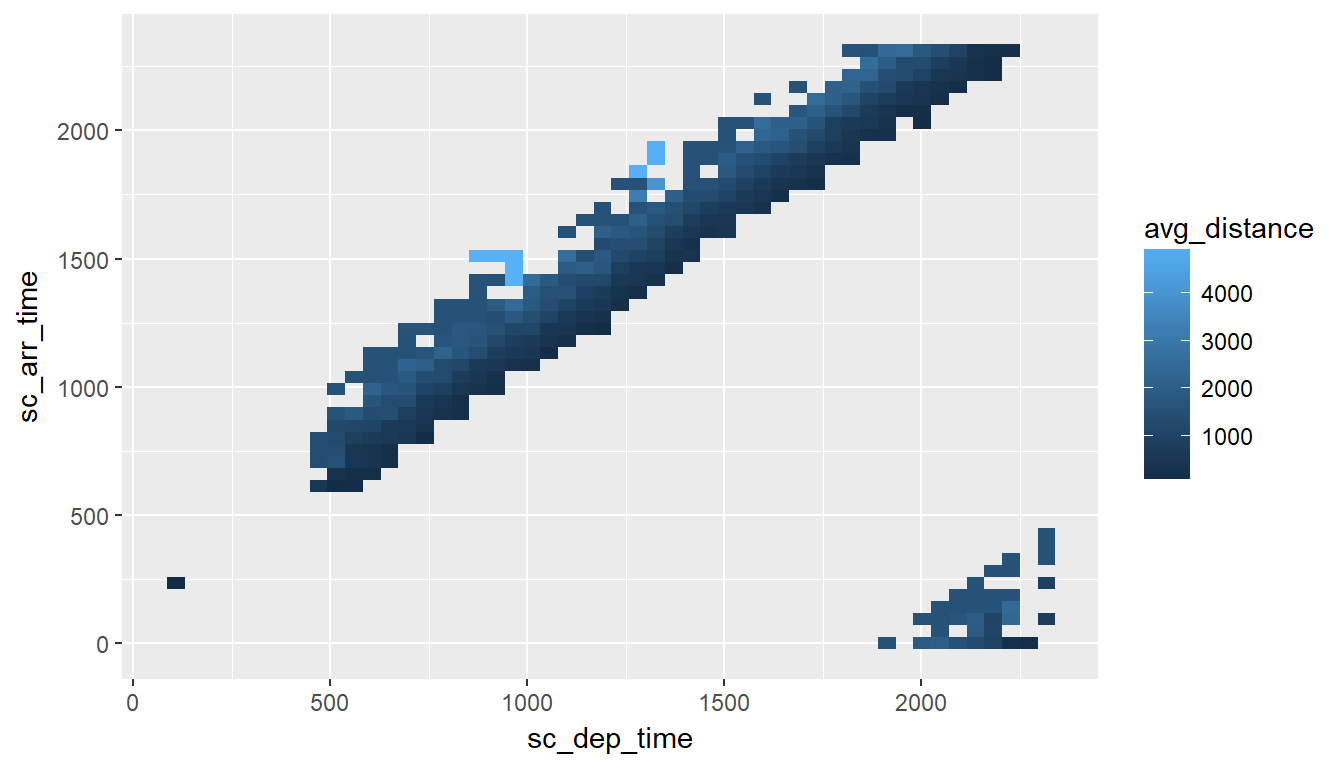
Considerations
There are two considerations when using a Raster plot with a database. Both considerations are related to the size of the results downloaded from the database:
The number of
binsrequested: The higher thebinsvalue is, the more data is downloaded from the database.How concentrated the data is: This refers to how many intersections return a value. The more intersections without a value, the less data is downloaded from the database.
In the previous example, there is a maximum of 2,500 rows (50 x 50). Because the data is highly concentrated, only 353 records are returned. This means that the data will be transmitted over the network quickly, but the trade-off is that the picture definition may not be ideal to gain insights about the data.
In the following example, the “definition” is set at 100 x 100. This improves the resolution but it quadruples the number of records that could potentially be downloaded.
tbl(con, "flights") %>%
  group_by(
    sc_dep_time = !! db_bin(sched_dep_time, bins = 100),
    sc_arr_time = !! db_bin(sched_arr_time, bins = 100)
  ) %>%
  summarise(avg_distance = mean(distance)) %>%
  collect() %>%
  ggplot() +
   geom_raster(aes(x = sc_dep_time, y = sc_arr_time, fill = avg_distance))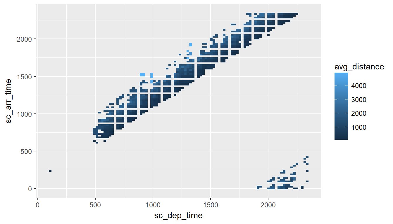
Use an R package
The dbplot package provides helper functions that automate the aggregation and plotting steps. For more info, visit the dbplot site.